
Rebranding a Community-loved Bookstore
Giving Book Buddies, a decade-old bookstore, a comprehensive brand identity and a digital presence.
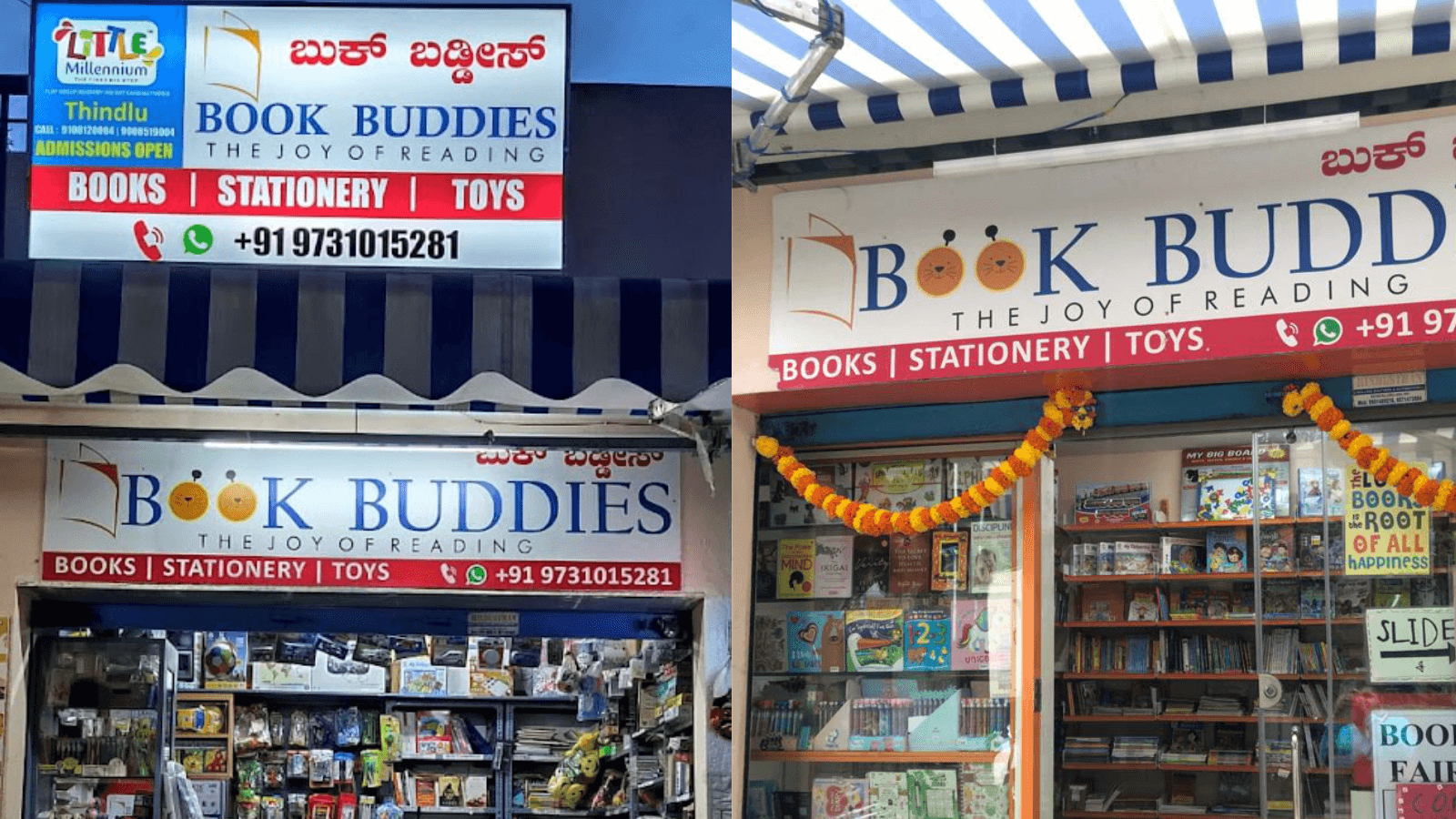
Caption: Book Buddies storefront
We can officially confirm: the universe rewards those who go to an actual store for their stationery.
It all started with a dot-grid book Shiv wanted. He was at Book Buddies, a stationery/book store, justifying to Raksha why he needed that specific book for sketching logos when Jaspreet Humcha and Arveen Kaur, the store owners, overheard the conversation and approached them about a logo they needed for their business. That casual moment was the spark that ignited the entire project.
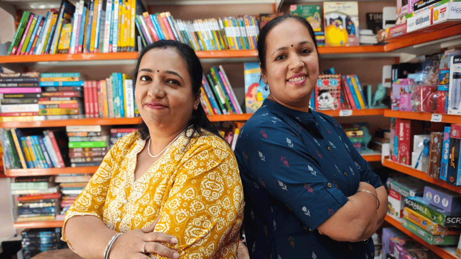
Caption: Jaspreet and Arveen
And we were thrilled. As a studio full of book lovers with, let's be honest, an unhealthy obsession with stationery, this interaction just clicked. Jaspreet and Arveen were deeply committed mompreneurs whose drive to give back to the community through education was palpable. Their business was truly a family affair: their family were always there to support them, be it minding the store or accompanying them to exhibitions to sell books.
But as great as the clients were, the project had more moving pieces than a Rube Goldberg machine - from hyper-detailed logos to orchestrating a three-platform pivot.
This project spanned several months and had a staggered timeline, so we’ve distilled our engagement with Book Buddies into a few essential episodes, each highlighting the challenges we solved in specific tracks and the effort we poured into Book Buddies' final identity.
Project Management: The Art of Doing Five Things at Once
The scope covered a lot of things:
A new brand identity
An e-commerce website
Several print/digital assets
Parental Education material
So this project had most of our team members wearing different hats each day to attend to the different verticals in the project.
Working with the friendly neighborhood bookstore certainly had its merits: Shiv or Raksha could step into their store for updates on the way to breakfast. Meetings and presentations happened at cafes or restaurants over meals. Conversations had more warmth and laughter, not the traditional client conversations rife with corporate jargon.
But it had its challenges as well.
There were days with an uptick in footfall at the store, for which they needed assets. Or even opportunities to set up stalls at exhibitions which Jaspreet and Arveen got to know just a day or two before.
And add to this, personal challenges they couldn’t just delegate to their staff.
This translated to messages that came in an hour before a meeting requesting a reschedule or a meeting that began at 9 in the night.
We respected our clients' hustle, but the continuous delays taught us a harsh truth: A long project is a hungry beast that devours momentum.
Website Development: You can’t plan for all the ways things go wrong
We were strapped for budget, so we chose an inexpensive platform that would get the job done: Odoo. A robust system that allows you to experiment easily without writing custom code for everything. We informed Jaspreet and Arveen and, with their go-ahead, started development.
Once we had a template set up, we presented the option.

We sensed the energy shift immediately. A few days passed. No updates.
We love honest feedback, but when the client finally got back to us, the truth stung a bit. We had a couple of issues. The client felt the design was dated and to add to it, we realized we needed an app from Odoo to take care of a simple discount calculation. Which pushed the budget.
The advantages of Odoo didn't outweigh its lack of customizable options. So we abandoned it.
Back to the drawing board again, Shiv, Raksha, and Suhas had extensive discussions about this, and after a lot of trials and errors and comparisons, we arrived at our solution:
Framer for the main site plus a Shopify site for their e-commerce needs.
The next hiccup was migrating the design.
Framer and Shopify did not have the drag-and-drop convenience that Odoo did. The layout that took 10 minutes to put together on Odoo took 2-3 hours to create on the new platforms.
But Suhas and Shiv got to work, a tweak here and a nudge there, the website was ready.

Caption: The elements moved with the cursor!
Huzzah.
The next leg was inventory.
Of course, Book Buddies had thousands of items spanning from books to stationery. Jaspreet and Arveen wanted the inventory system to be simple and intuitive. Raksha immersed herself in deep research to find the right fit but the real work was in the implementation. She provided concentrated, hands-on support through several planned visits to the storefront.
While Raksha helped with the inventory, the rest of us were tasked with another technical challenge. The client needed a not-so-traditional requirement: customers had to be taken directly to the BookBuddies’ team’s WhatsApp chat after selecting products, bypassing the standard e-commerce checkout. This was so that the customers had a chance to chat with the owners to ask any doubts or questions they had. It also captured some of the magic a customer at the store felt when speaking to Jaspreet or Arveen while they made a purchase.
But achieving that was a bit of a workaround.
There was no reliable plugin available for Shopify to facilitate this - not without custom code atleast. How do we solve this then?
Enter Suhas Rao, coding extraordinaire and single-minded problem solver. Still not having met a problem he couldn't solve, he went ahead and developed a solution.

The result was a custom plugin designed for this specific functionality. Now, any customer who visited the BookBuddies site ended their purchase with a digital equivalent of chatting with Jaspreet or Arveen at the checkout line.
The technicalities aside, we also wanted something that’d capture the essence of what BookBuddies meant to the community.
There’s always a soft murmur at BookBuddies: Arveen or Jaspreet chatting with a customer, a parent smiling while their child makes their case about a book they want to buy, and teenagers debating what they should invest their pocket money in.
We did this by incorporating the testimonials from their customers. Here’s one example for you to take a look at.
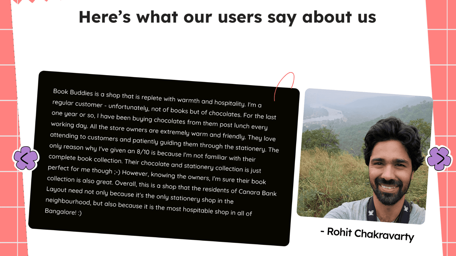
Caption: We picked one of the more elaborate ones to show you.
On one end, Shiv and Suhas did their thing with the website design and development, while on the other, Sujay had his hands full with the logo.
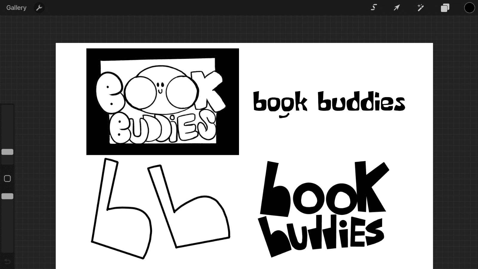
Logo: The “Process”
We began the logo stage by exploring a universe of concepts, collecting several references, making moodboards, and throwing out cool ideas for the logomark and wordmark.
Our plan was to take high-quality printouts of these various directions and showcase them to the client. This way, they’d see how the choices looked in print, and it made the process of choosing more fun.
A few of the concepts we really enjoyed creating were…
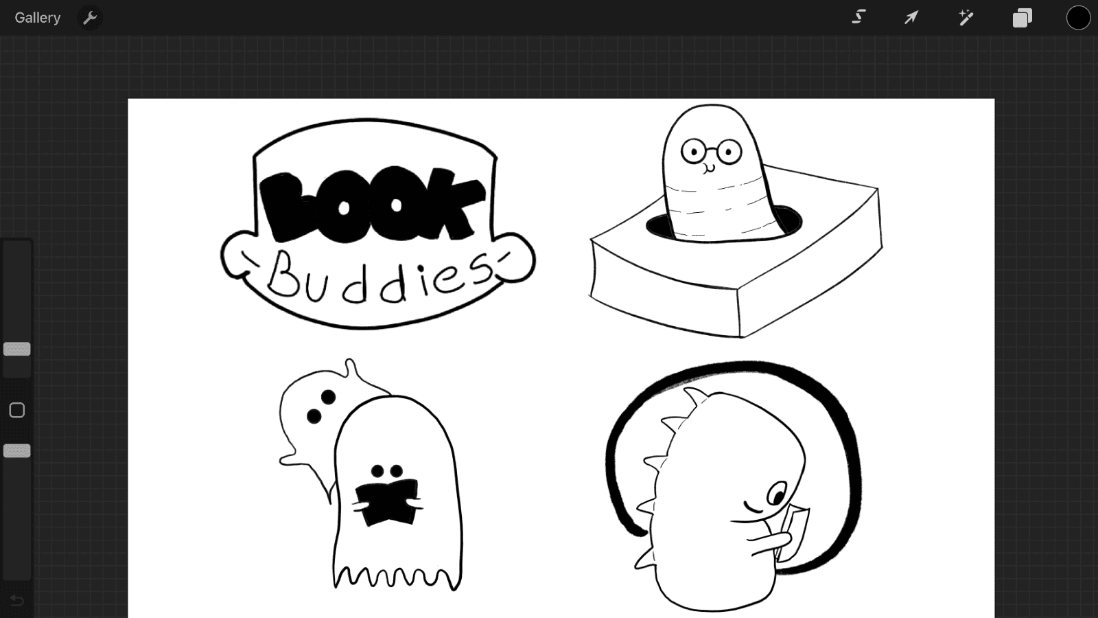
The Quirky Mascots: We tested animal-themed concepts, wordmarks, and sketches of ghosts reading to convey immediate playfulness.
Caption: We envisioned the “B”s as a pair of walking feet
Caption: Clearly, we loved the walking Bs.
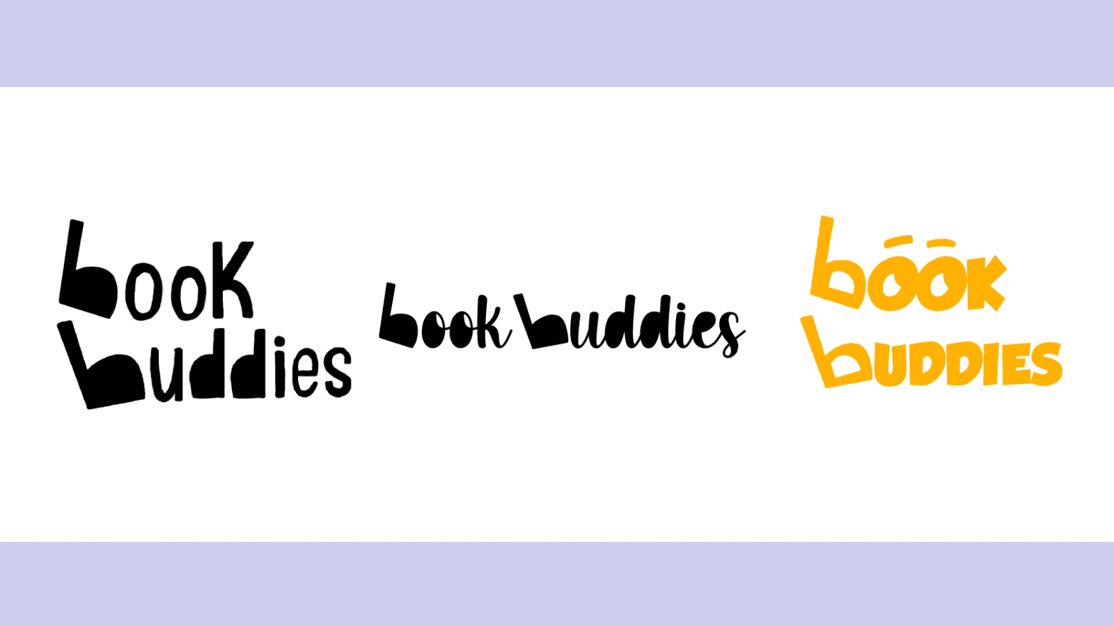
Chunky Typography: We developed chunky, graphic wordmarks to appeal to a younger customer base and the clean, whimsical "Walker B" logo where the 'b's were stylized feet.
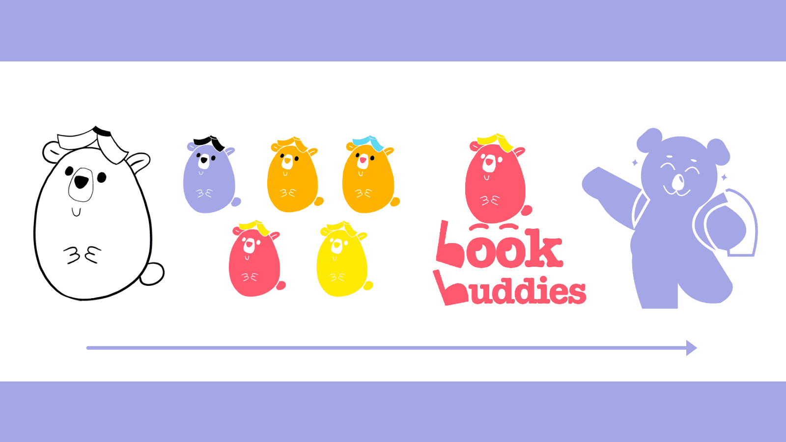
Caption: Evolution of the bear
The Simple Mascot: One mascot we all were drawn to was the bear. We created endearing, simple cartoon bears with playful script fonts that we felt perfectly captured the brand's youthful energy.
On the day of our presentation to Arveen and Jaspreet, we were incredibly excited to see which logo they’d pick. But it turns out that having too many options can also be a problem. They were both a bit confused initially with all the concepts that were presented to them but they slowly started gravitating towards one.
The Final Choice
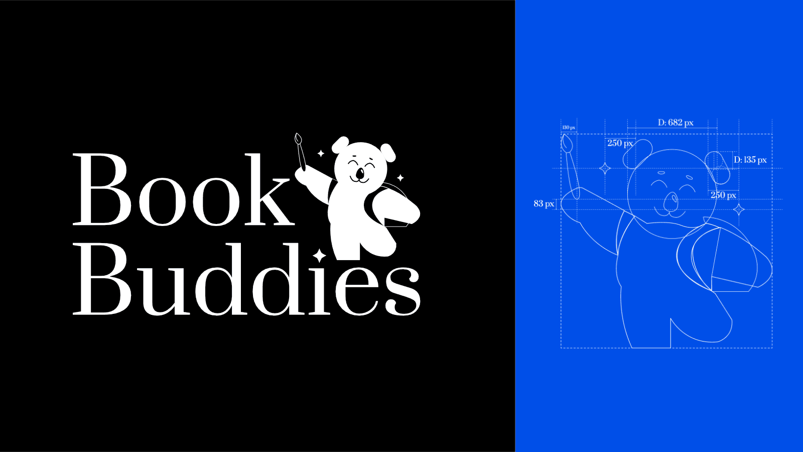
Shiv and Raksha watched as their hands finally rested on the logo that featured the bear with the backpack.
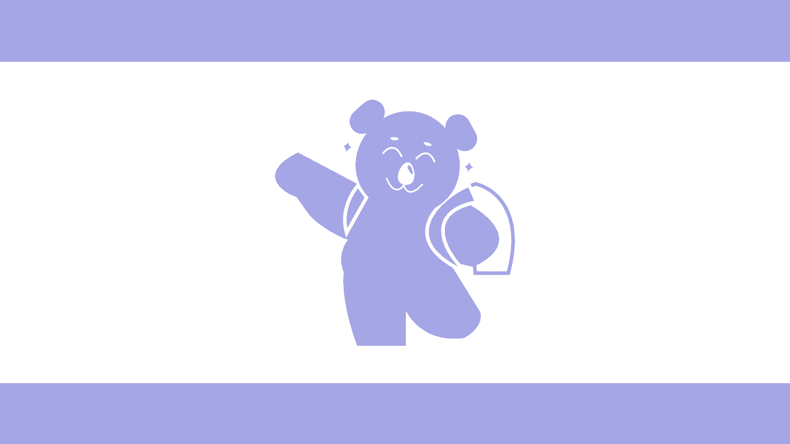
They told us that they were attracted to this bear because it reminded them of a kid going to school, sporting a backpack. Book Buddies was a store that also sold back-to-school kits and art supplies, so this bear mascot made sense. Plus there were two sparkles on the sides that could represent the two mompreneurs. We later named the bear AJ, for Arveen + Jaspreet.
While it was originally generated using AI, Sujay cleaned it up and gave AJ the bear its final form, including a paintbrush that the clients requested.
All of this meant that the design came out looking a bit busy, there were quite a few details and it wasn’t visually simple to execute.
But it perfectly symbolized the founders' personal mission.
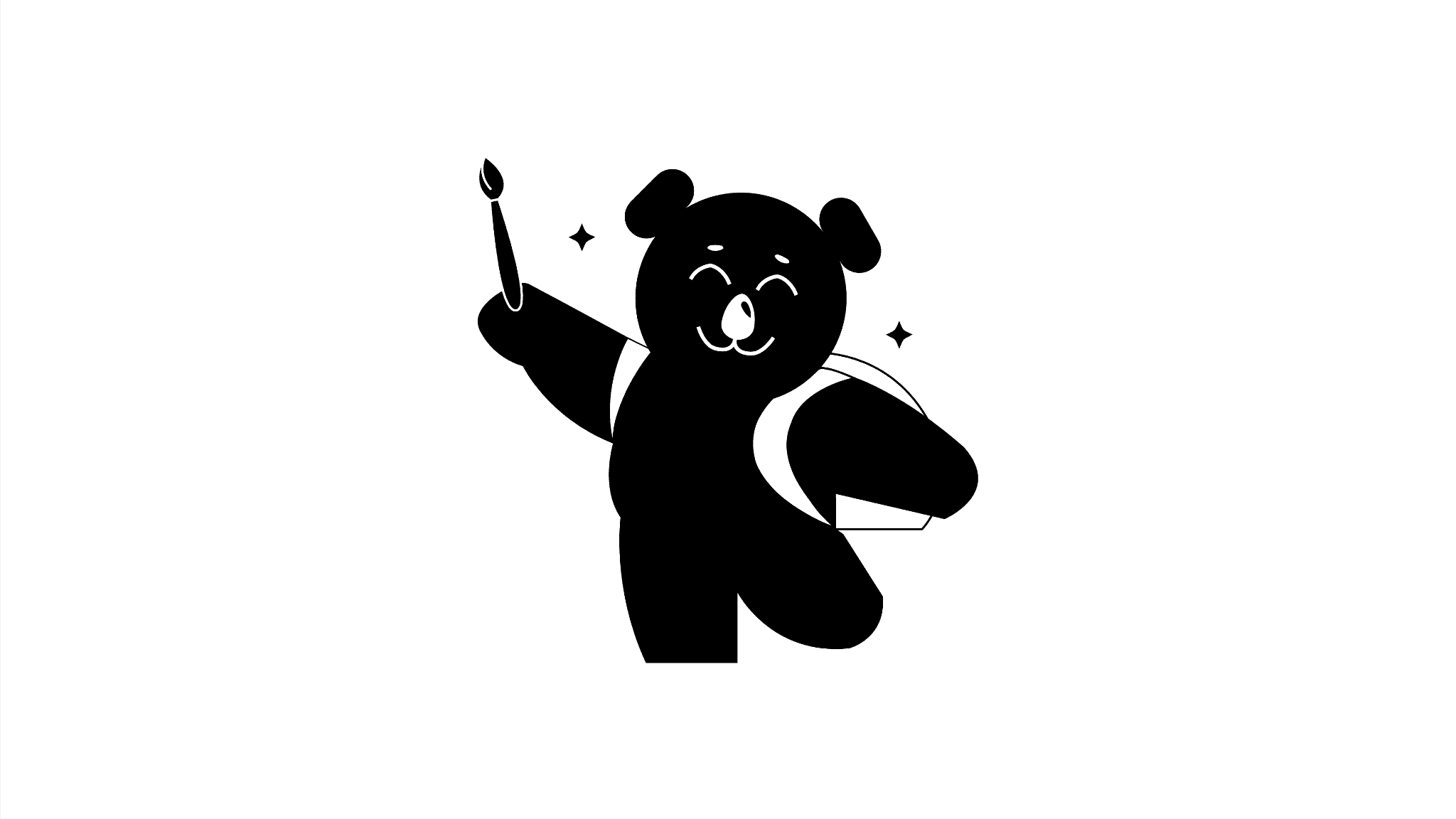
Caption: Ta-da!
They could see themselves telling a story with it. It made them confident. At the end of the day, isn’t that what really matters?
Sujay
What this meant to us was that a founder’s personal meaning always wins over the designer's principles of keeping the logo simple.
We proceeded with the wordmark.
The main wordmark itself is designed with the elegant typeface Prata. Out of all the fonts we’d pitched, they liked Prata the best as it conveyed a sense of heritage, legacy.

But I wasn’t pleased with it. The logomark and the wordmark felt like neighbours who did not want to shake hands. So I replaced the dot over the 'i' with a sparkle.
Sujay
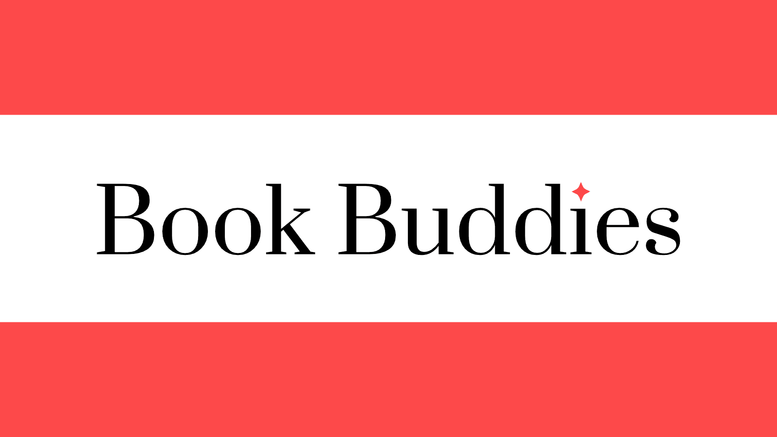
The same sparkle that AJ the bear had. This small, custom detail visually bridged the gap between the classic, quality feel of the lettering and the playful nature of the brand with the mascot. It represented the joy of discovering a new book.
Finally… I could rest in peace.
Sujay
Visual Identity: All’s well that ends well (?)
We started the process of forming Book Buddies’ visual identity by compiling a few moodboards for us to draw inspiration from.
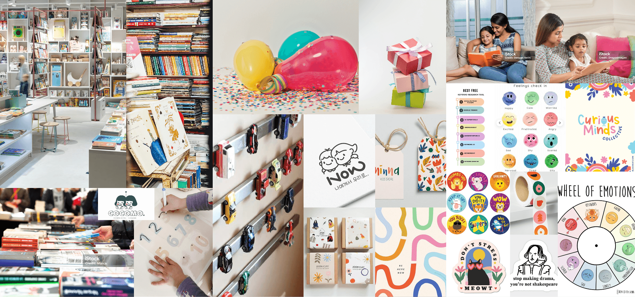
Caption: One of three moodboards. We chose some of the images that represented the elements that exist in their store.
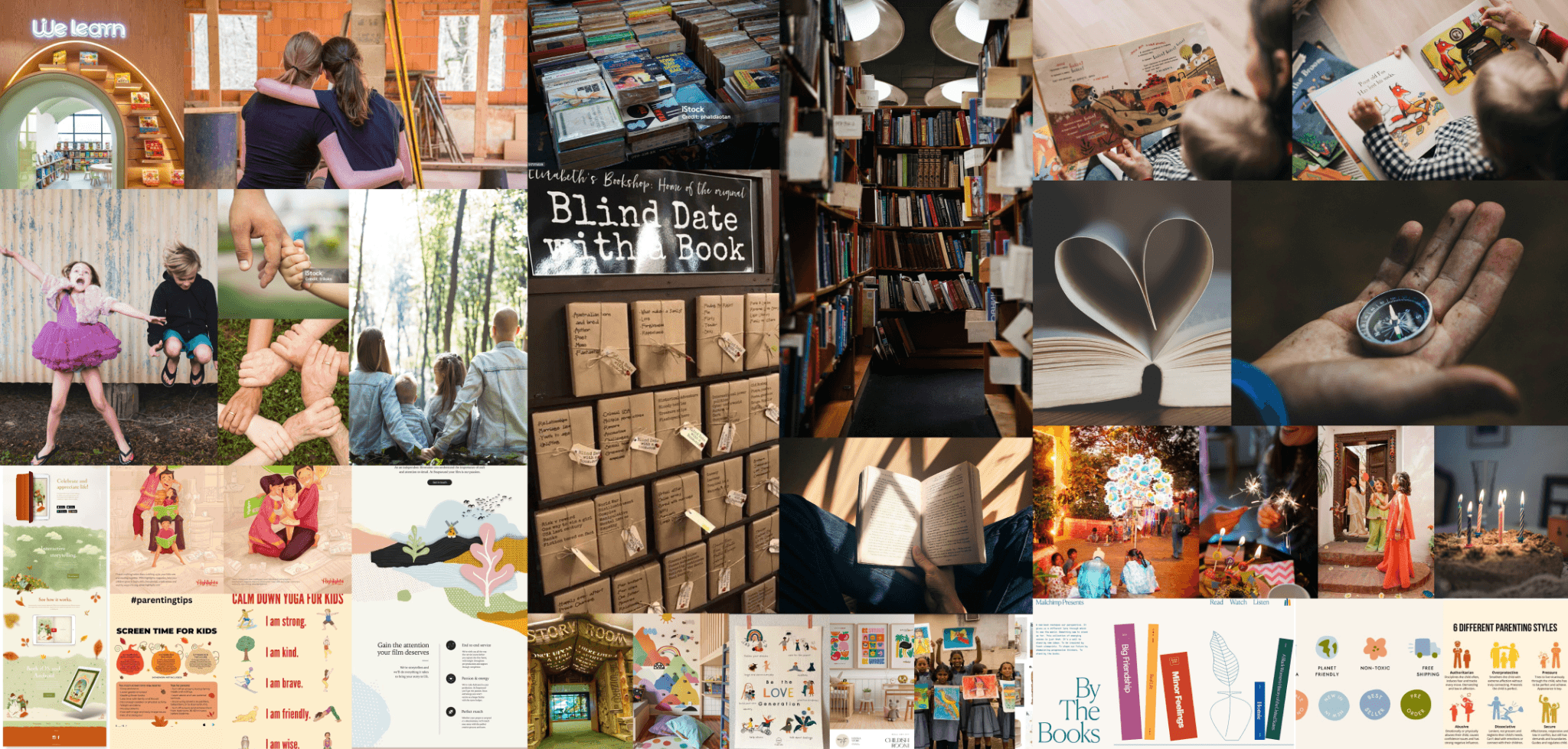
Caption: We also chose images that best captured their values and archetype.
It was a bumpy start, with deadlines prolonged and founders unavailable to discuss feedback. Days turned to weeks, weeks turned to months. But we trudged along, designed the visual identity as the website and other deliverables progressed. One deliverable informed the other. Some more pivots later, we got to the best part of the engagement: seeing the brand implemented consistently across every touchpoint.
For which, we needed a solid brand guide.
Ask and ye shall receive.
Sujay
We compiled all of that effort into a detailed brand book - covering Brand Positioning, Logo, Colors, and Typography.
The Anatomy of the Identity
The entire identity was anchored to one goal: to create a digital transformation that’s an extension of the founders’ philosophy.
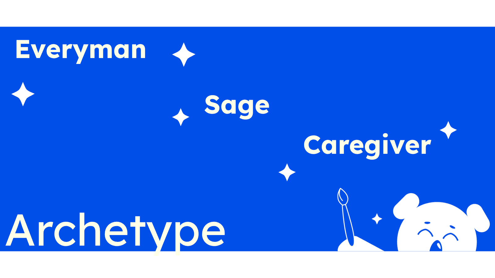
So we zeroed in on a few archetypes for the brand persona: Everyman archetype (approachable and community-focused), supported by the Sage and Caregiver (for the educational and parental knowledge that Jaspreet brings).
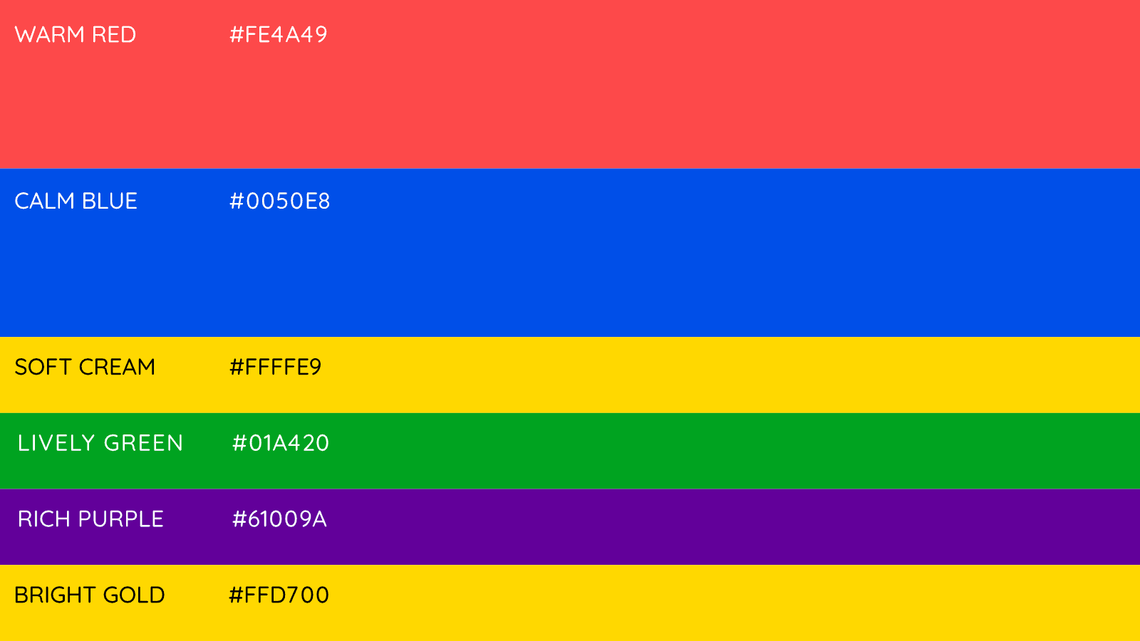
The Palette: We defined a vibrant, high-contrast palette. Warm Red and Calm Blue symbolise the balance between passion for learning and a welcoming environment. Secondary colors like Rich Purple added a touch of wisdom, while Lively Green, Bright Gold and Soft Cream represented growth and joy.
The Typography: Picking the right font for BookBuddies was tricky. We had a few things to consider: The fonts must be clear to read and must give the impression that these are experts when giving educational guidance, but they must also be completely approachable and fun for the kids.
The fonts must convey timelessness, since Book Buddies had a legacy to uphold. So we went with two typefaces: a reliable, formal font for parents, and a totally joyful, playful one for everything else that’s fun. This way, we honor both sides of their personality.
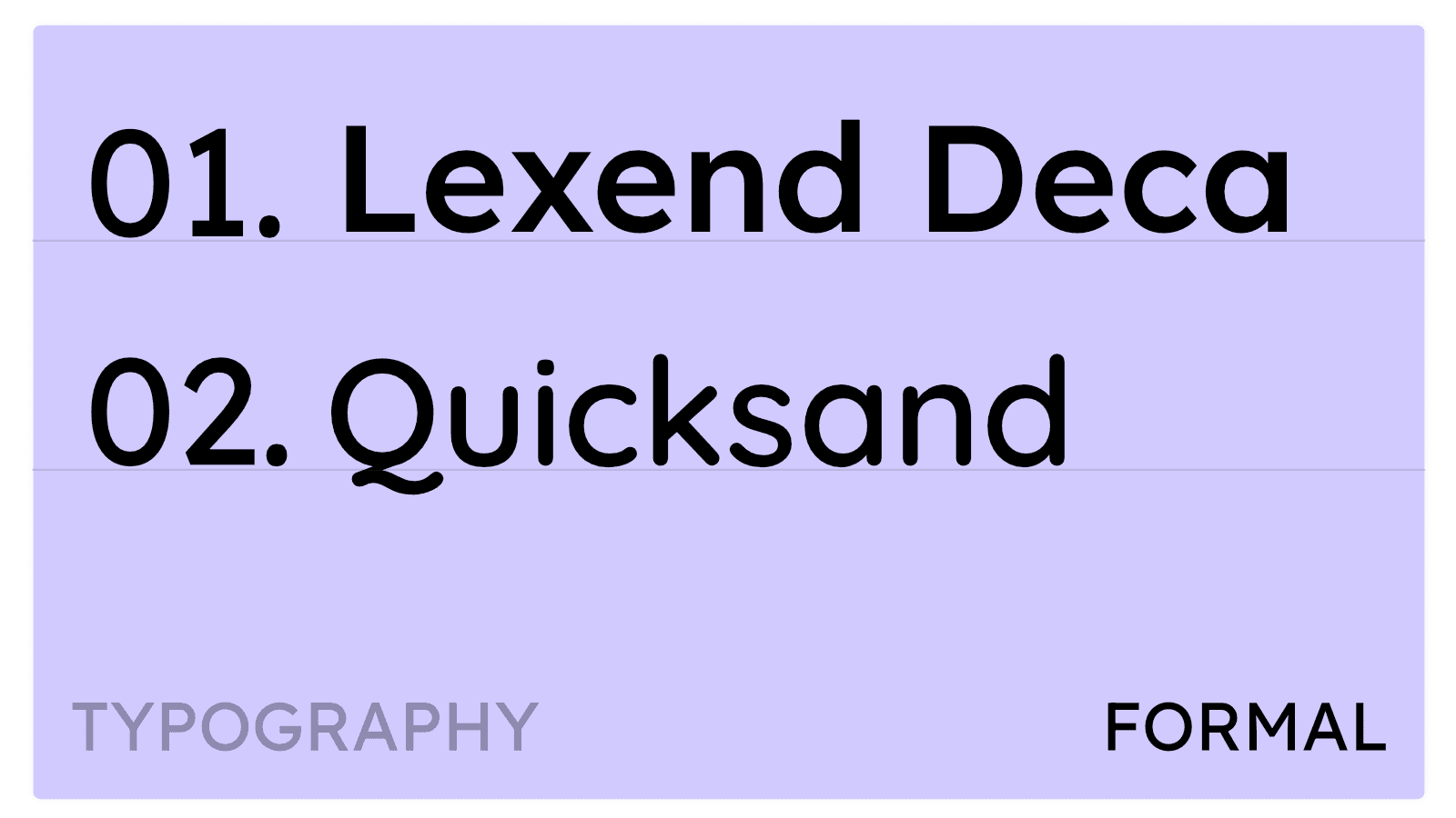
The Formal Typefaces: For headers and body content requiring clarity and timeless quality (like business cards and official communications), we selected Lexend Deca and Quicksand.
These fonts sat well with the archetypes of Sage and Caregiver, embodying clarity for Sage and a sense of approachability for Caregiver.
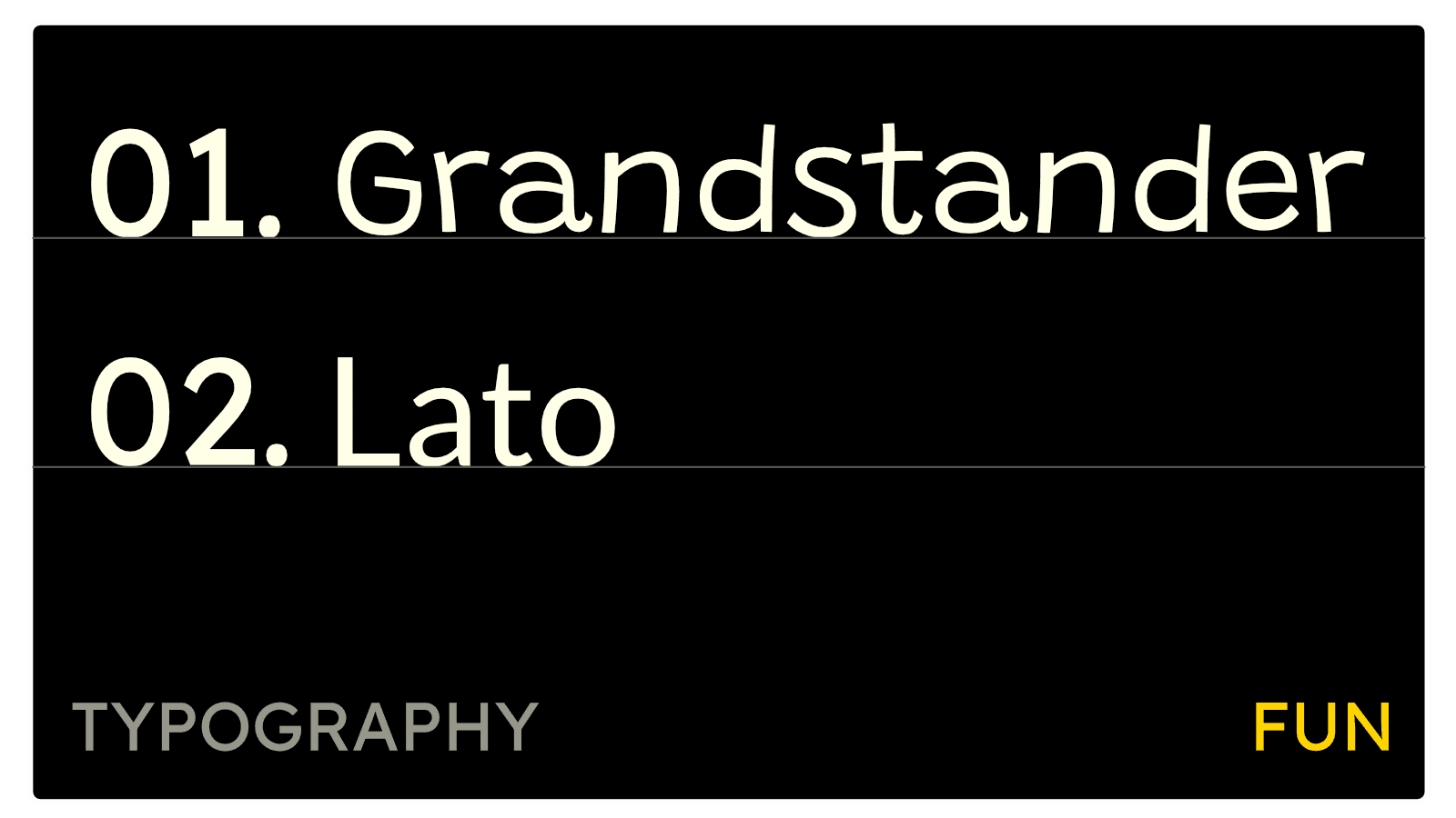
The Fun Typefaces: For packaging, social media, and interactive material, we chose Grandstander and Lato.
These fonts impart the required energy and whimsy, reflecting the child-friendly charm of the mascot, AJ.
The Kannada Logo: A Last-Moment Scramble
If you’ve read our case studies , you’ll know that logo making is never a linear process. And it wasn’t in this case either. Book Buddies was rooted in the immediate community, that meant the brand must speak the local tongue - Kannada.
We had initially designed the large-format assets - the banners and standees - only in English. But their market required a regional inclusion, which meant we had to design the kannada version of the logo.
This was easier said than done. Our design software, Affinity, lacked a native Kannada script support. The wordmark ended up looking like a garbled GenAI hallucination. So we needed a workaround.
Sujay decided to write the text in a different tool, import that to Affinity Designer, and manually convert the text to vector shapes.
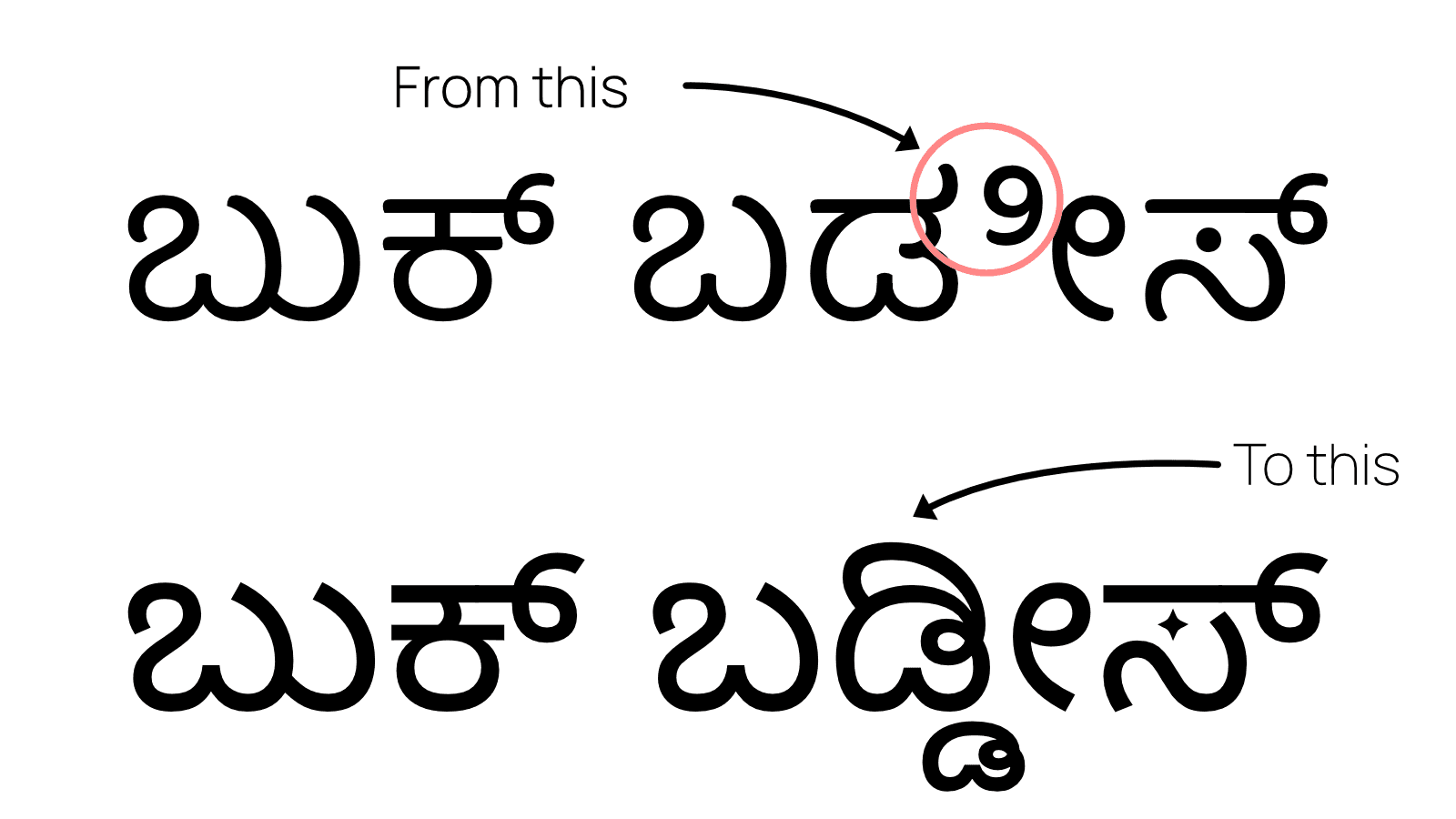
Caption: Rome wasn’t built in a day. The Kannada wordmark took more than a day too, like two days or something.
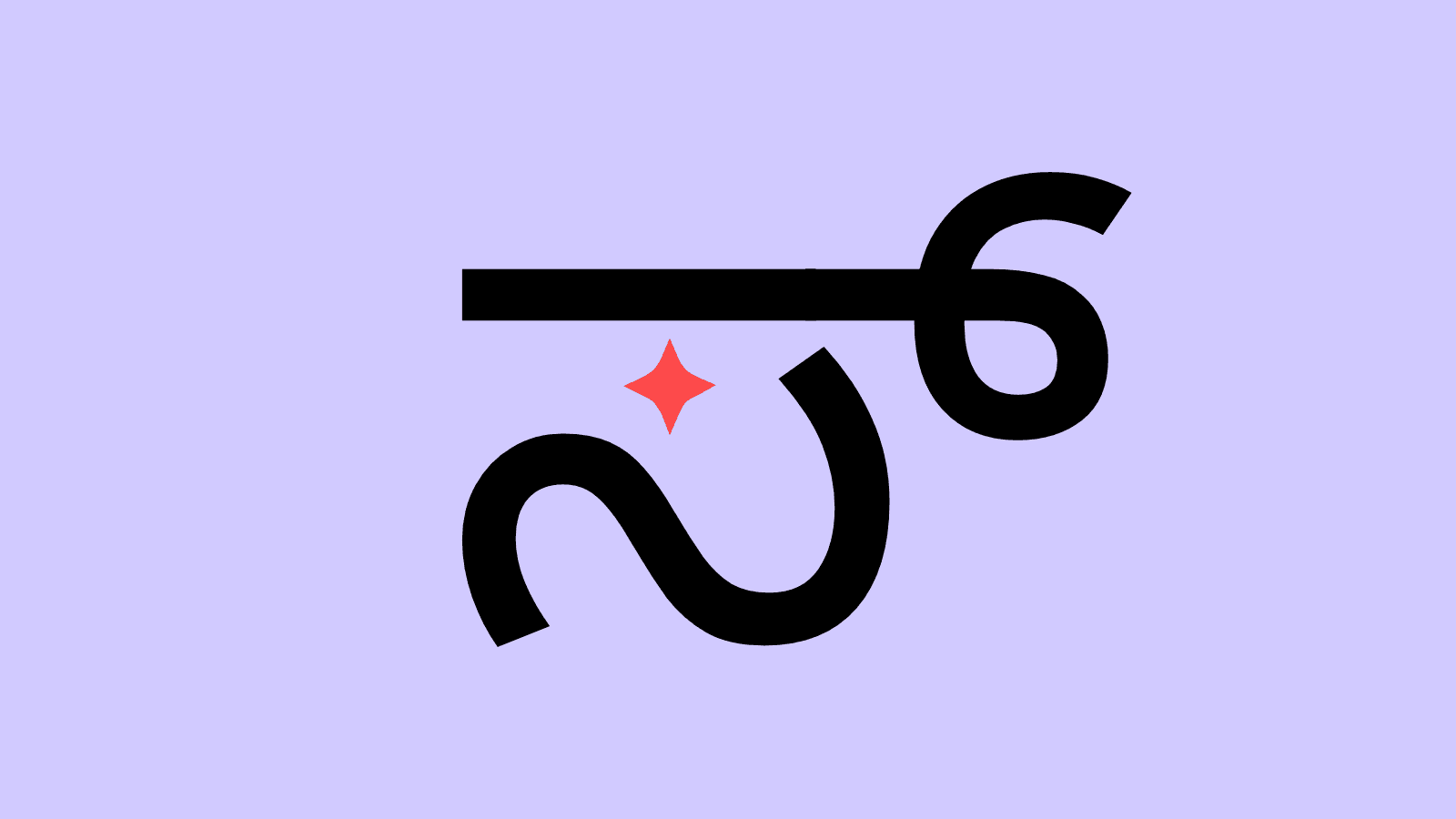
I was worried that the Kannada wordmark would have no character, but luckily we found the perfect place to add the sparkle .
- Sujay
This fix was critical for ensuring the final banners, standees, and bookmarks accurately displayed the wordmark in kannada. It was "ಬುಕ್ ಬಡ್ಡಿಸ್" alongside the English version of the Book Buddies wordmark.
We also had to move things around a bit on the banner and standee to make room for the Kannada wordmark but we were able to do this without too much hassle.
The Graphics: Playful, Bold, and Whimsical
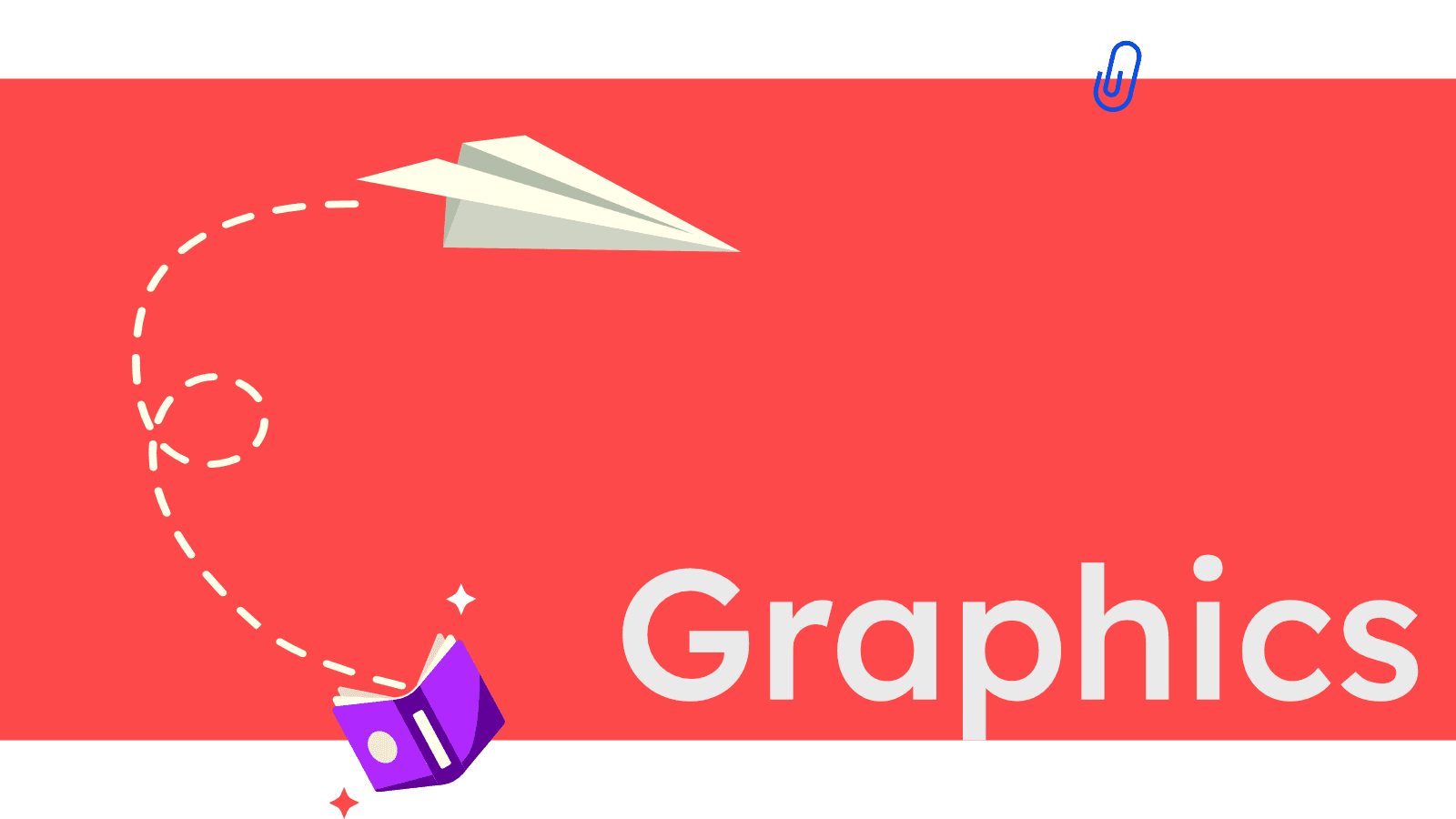
Early on, during a feedback round for the Odoo interface, it became clear we needed to ramp up the visual energy - we needed elements that were eye-catching and friendly for kids. To hit that mark while staying true to the Bookbuddies' charm, we settled on a style that is flat, illustrative, and fun.
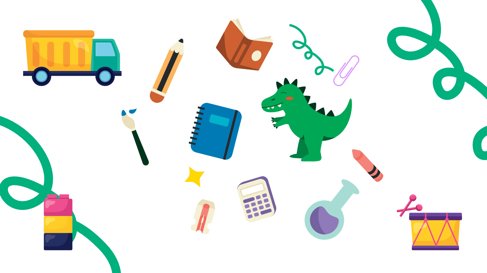
Caption: Toys, stationery, geometric shapes, and the sparkle of imagination
The graphics rely on simple, often geometric shapes, drawing their inspiration directly from the heart of the logo: the sparkle of imagination and the stroke of the paintbrush. It’s a design language that feels instantly playful and easy for everyone to understand.
These graphics, which included toy-inspired forms, stationery shapes, and abstract patterns, would add warmth and playful energy to the various layouts that the client would use them in.
For the imagery, we focused on portraying authenticity and emotional connection. This meant using photographs that show genuine parent-child moments of reading, emphasizing family togetherness and shared learning.
The intent was to pair these authentic moments with flat-lay shots of curated products like books and stationery, ensuring the visuals feel warm, relevant, and supportive of the overall Caregiver and Sage archetypes.
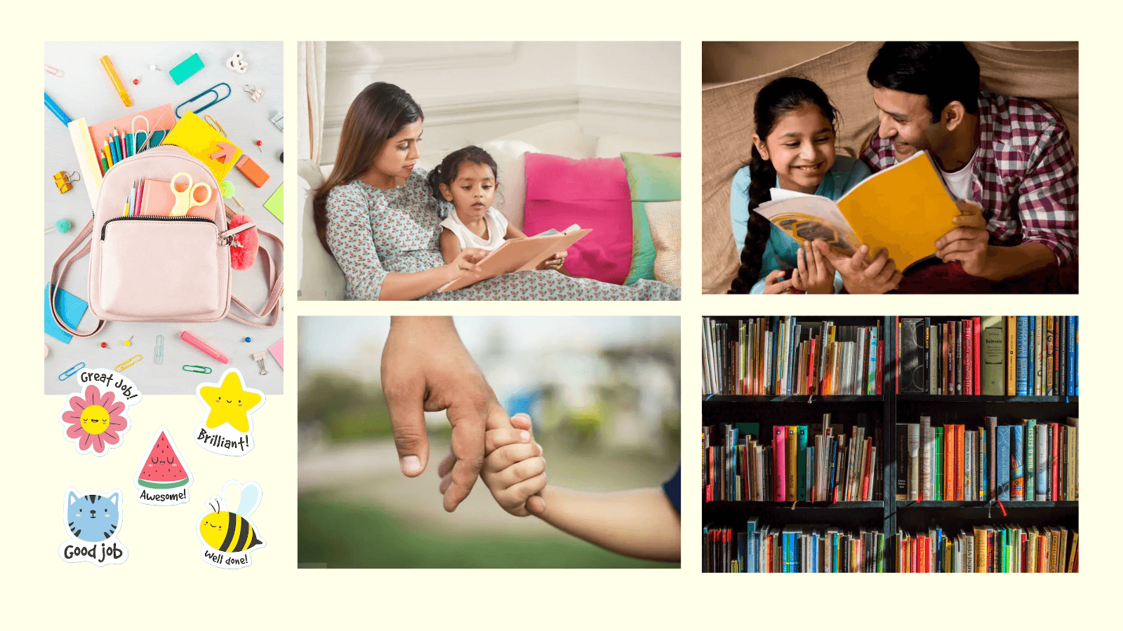
Caption: Books, stationery, and everything nice.
Brand in Use: From Presentation to Exhibition Floor
With the identity in place, the rest of the deliverables went per schedule. The final deliverables brought immense meaning to the entire team because months of effort culminated in an identity fully utilized in the real world.
Parental Guidance: Raksha and Vishnu went to work with the material Arveen sent their way into a compelling story/guide to assist the parents who attended Arveen’s parental guidance sessions.
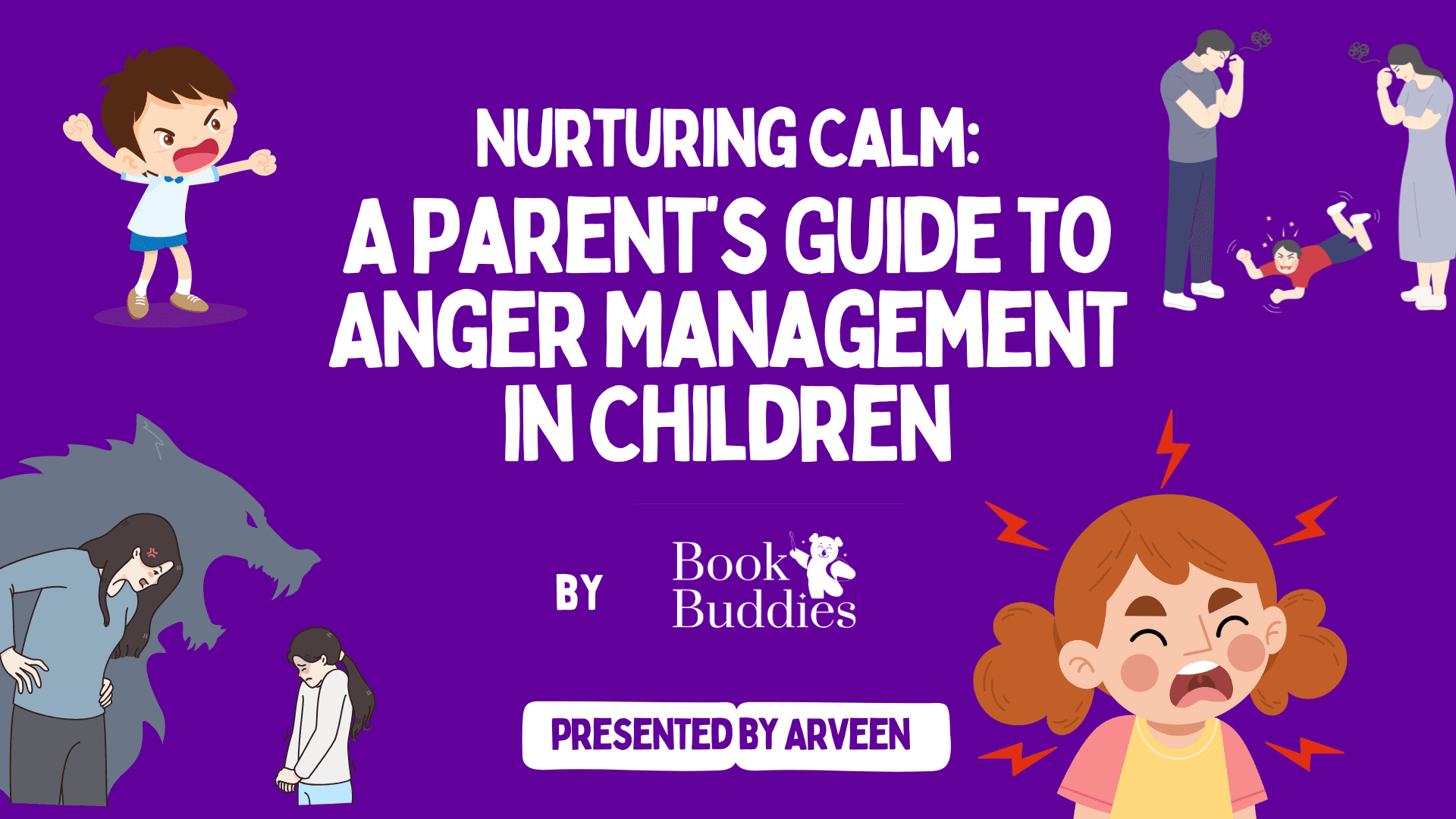
Caption: We wanted the images to say more than the words
While we began the project by simply mapping out Arveen's material for a conventional presentation, Arveen explained it needed to function more like her own personal assistant during the session.
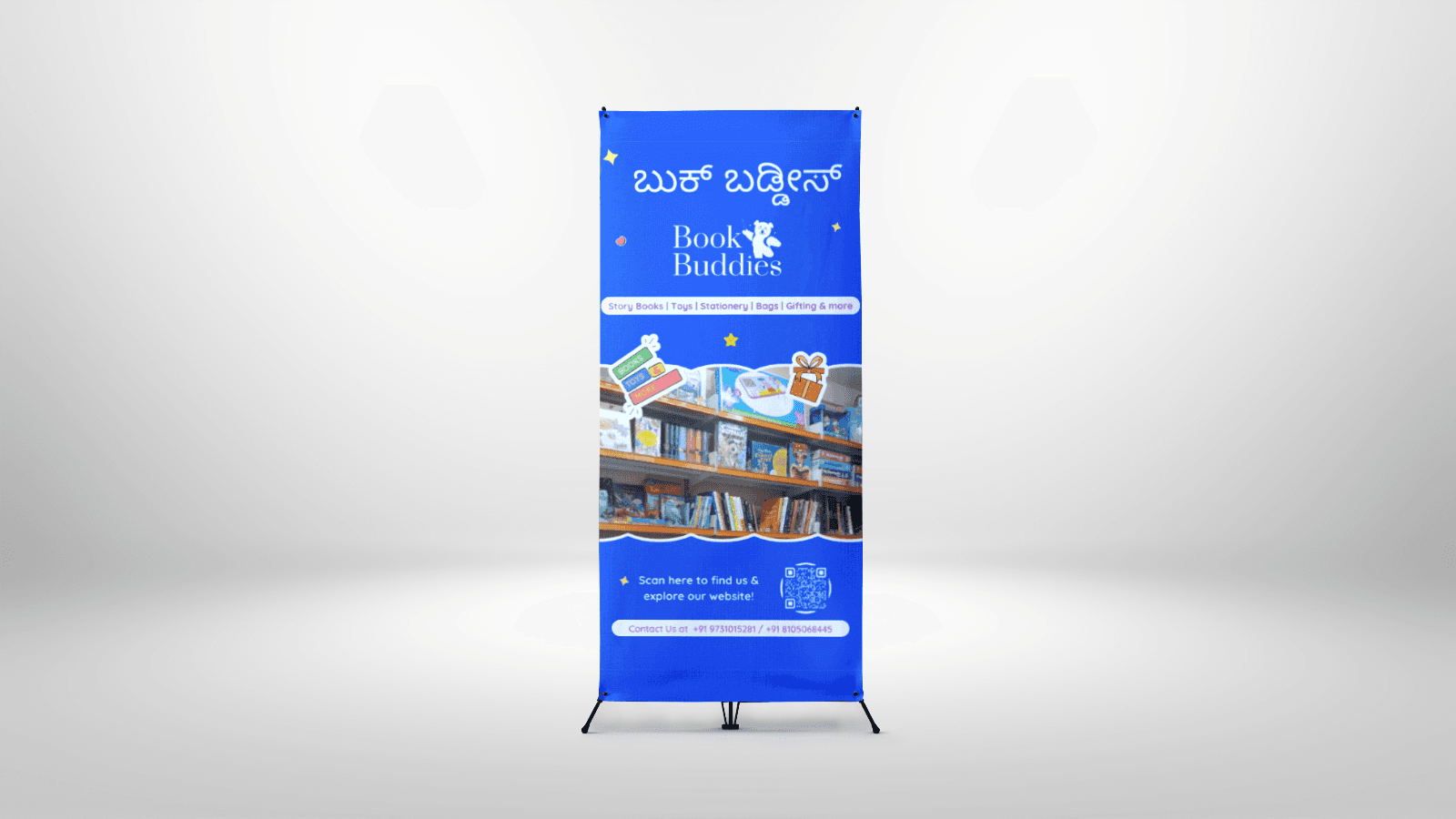
Caption: The standee
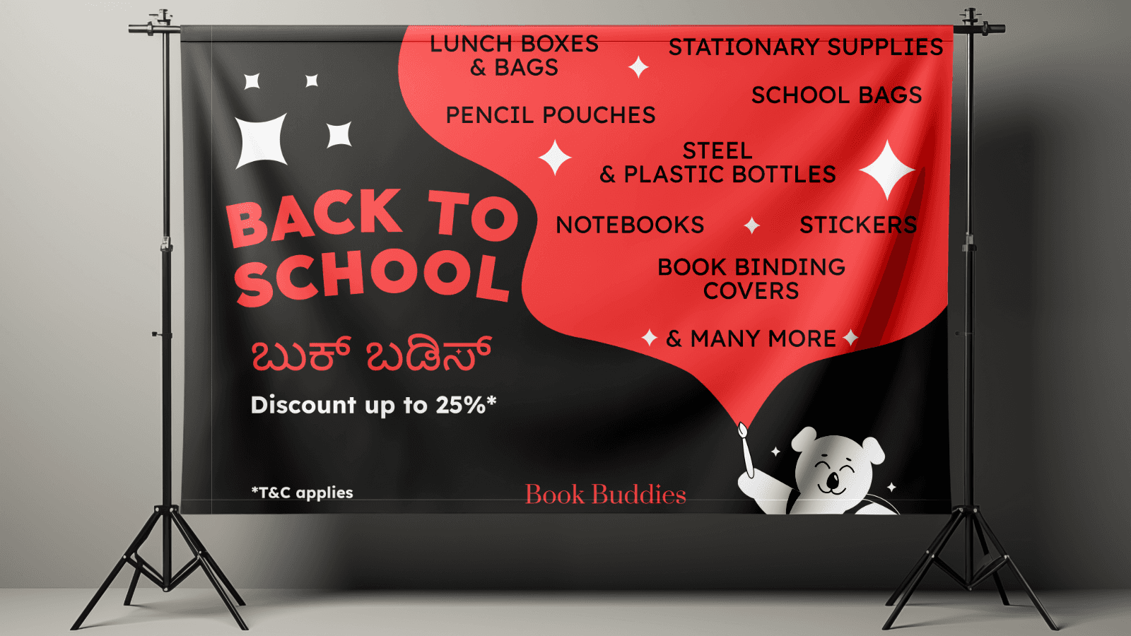
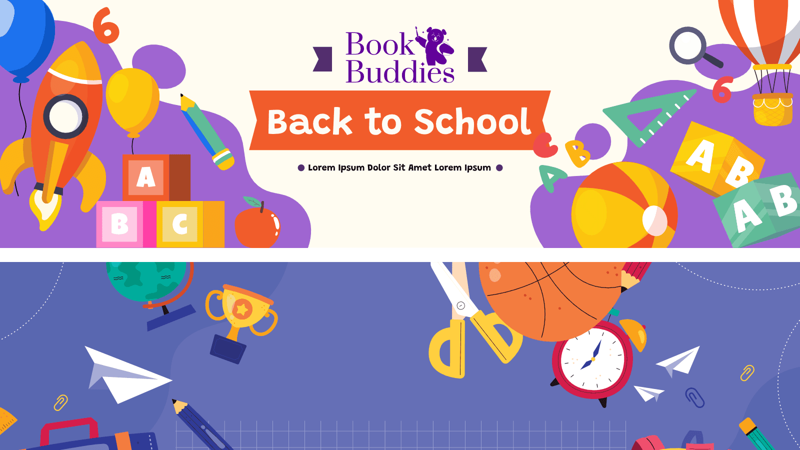
Caption: The Back to School poster
Exhibition Materials: Sujay and Shiv designed exhibition banners and standees for Arveen and Jaspreet, transforming their stalls into small, branded worlds that captured the magic and warmth of the brick-and-mortar bookstore.
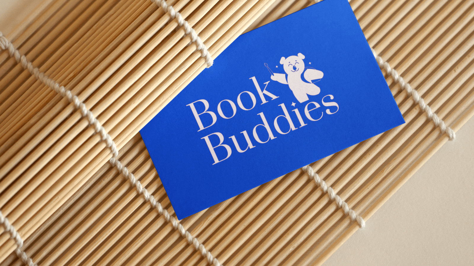
Caption: The business card
Business Cards: Sujay went through a lot of references and churned out iterations in different shapes and sizes before we zeroed in on the final design.
The Finish Line
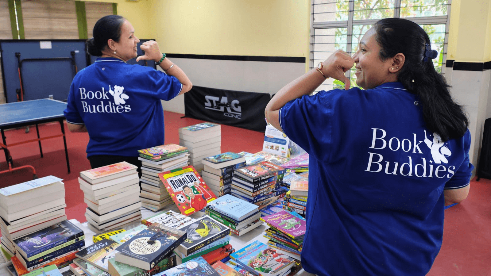
After many months of work, many sit downs, discussions, inventory and design, Shiv and Raksha returned to the place it all began–the store where they first got to meet Arveen and Jaspreet. The founders were dressed in their branded tees, getting ready for a big exhibition and taking stock of all the brand material.
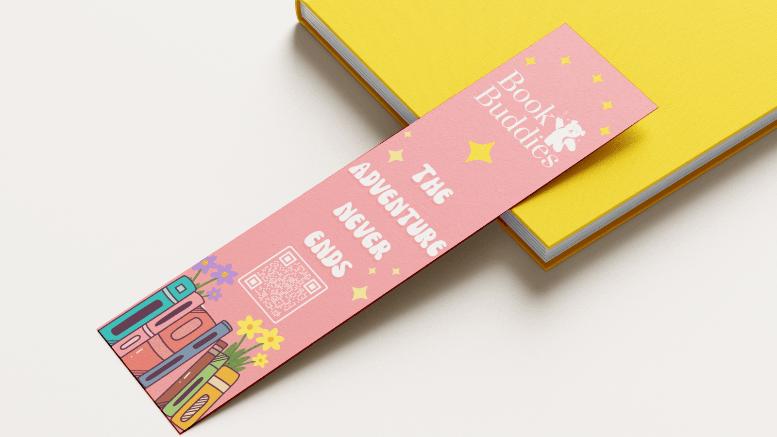
Caption: Bookmark
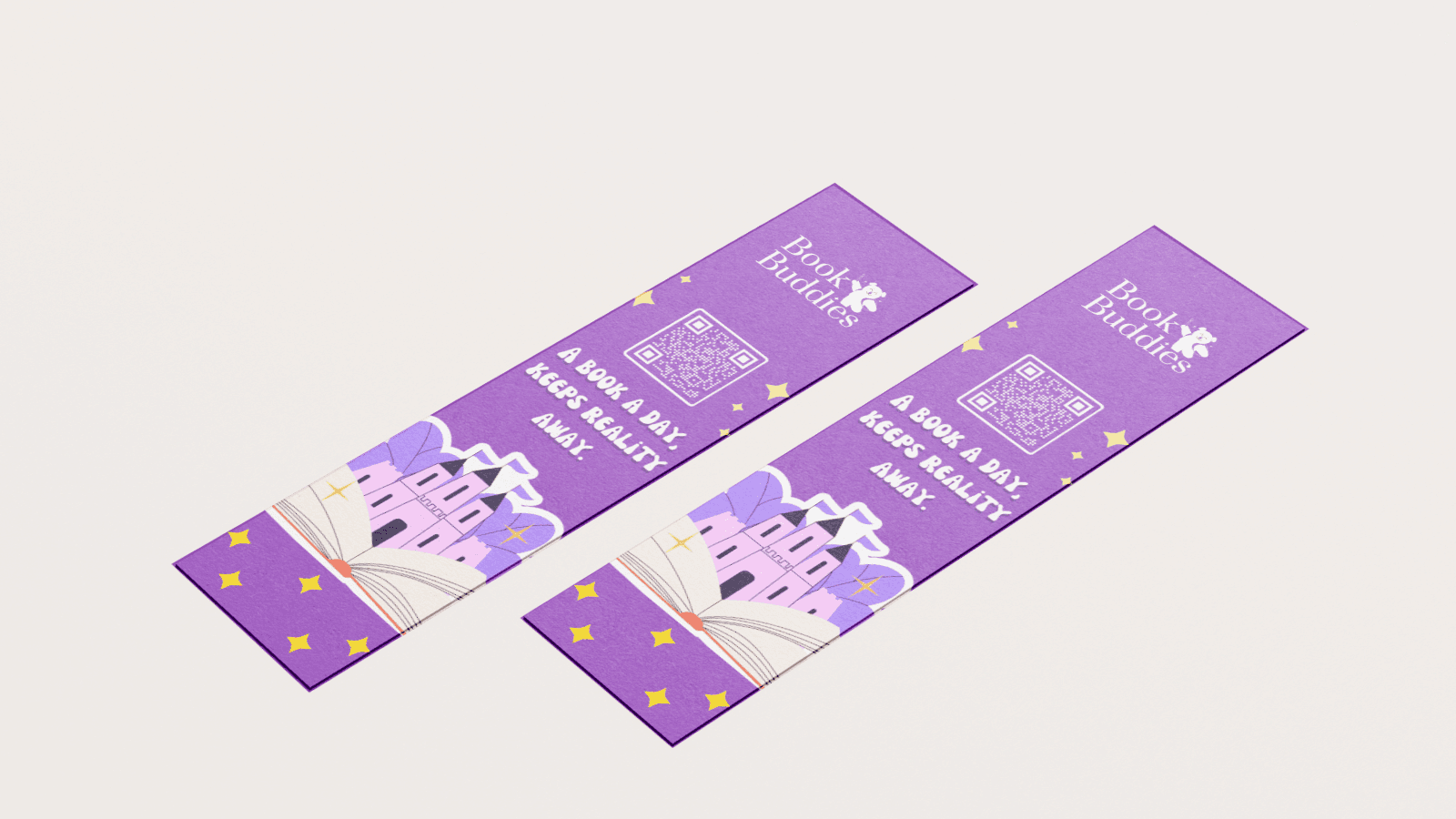
Caption: Bookmarks
The bookmarks that Shiv, Raksha and Vishnu designed were on display, ready to be handed out to customers at the store as well as at the exhibitions.
Seeing the brand in the flesh, and in the hands of customers on the exhibition floor made it all worthwhile.
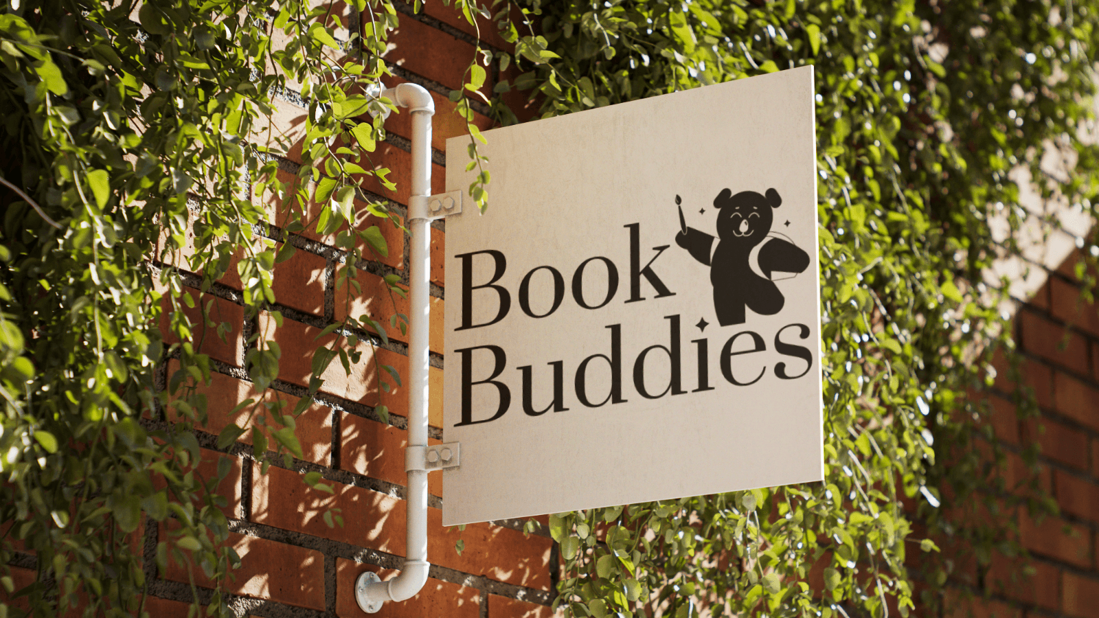
Caption: The logo in the wild
To us, the most rewarding moment was seeing the "Aha! moment" on the founders' faces when the Framer site launched. They finally felt comfortable and confident in expressing their business through their new digital identity.
Caption: Arveen and Jaspreet with the T-shirts that they printed a day before the exhibition
Hope you liked reading this project!
If you want to work with an agency that takes your challenges seriously, we'd love to talk to you.
We’re a curious bunch. Drop us an email at [contact@b-moat.com]. If we’re not the right fit, we’ll try to introduce you to someone who is.
Story, brandwork, and copy - Sujay
UI/UX - Shivkumar
Website design and development - Suhas
Design, Inventory - Raksha